Overview
Usagi 4.1 Beta 3 (4.1.3) is a “comfort + correctness” release built around one core change: SD Training Center now has a real central scheduler. Before 4.1.3, queue dispatch relied heavily on the web page’s runtime state — close the tab, refresh the page, and you could lose context (history/queue) or get inaccurate job state.
In 4.1.3, the Training Center becomes resilient and practical: close the page, refresh the browser, do whatever you want — training keeps running.
Highlights
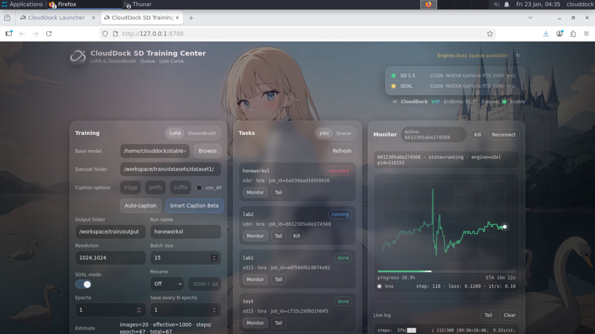
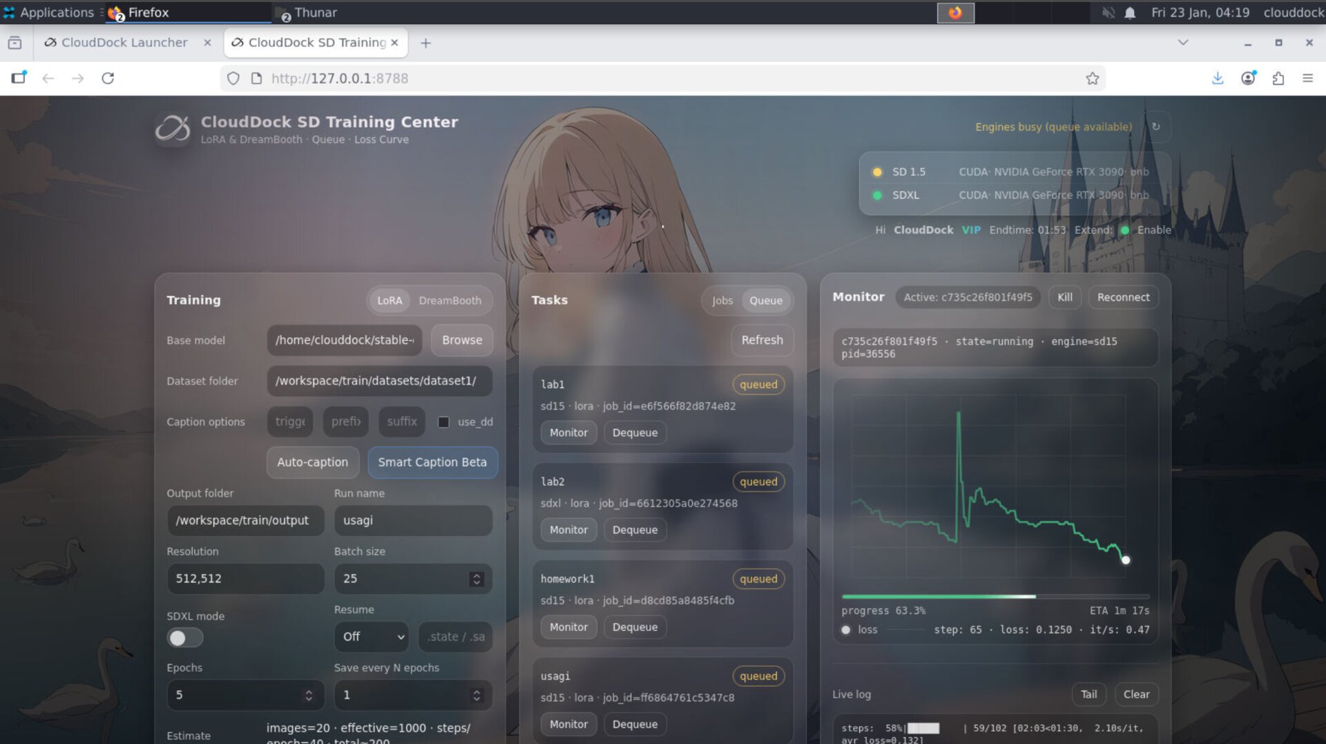
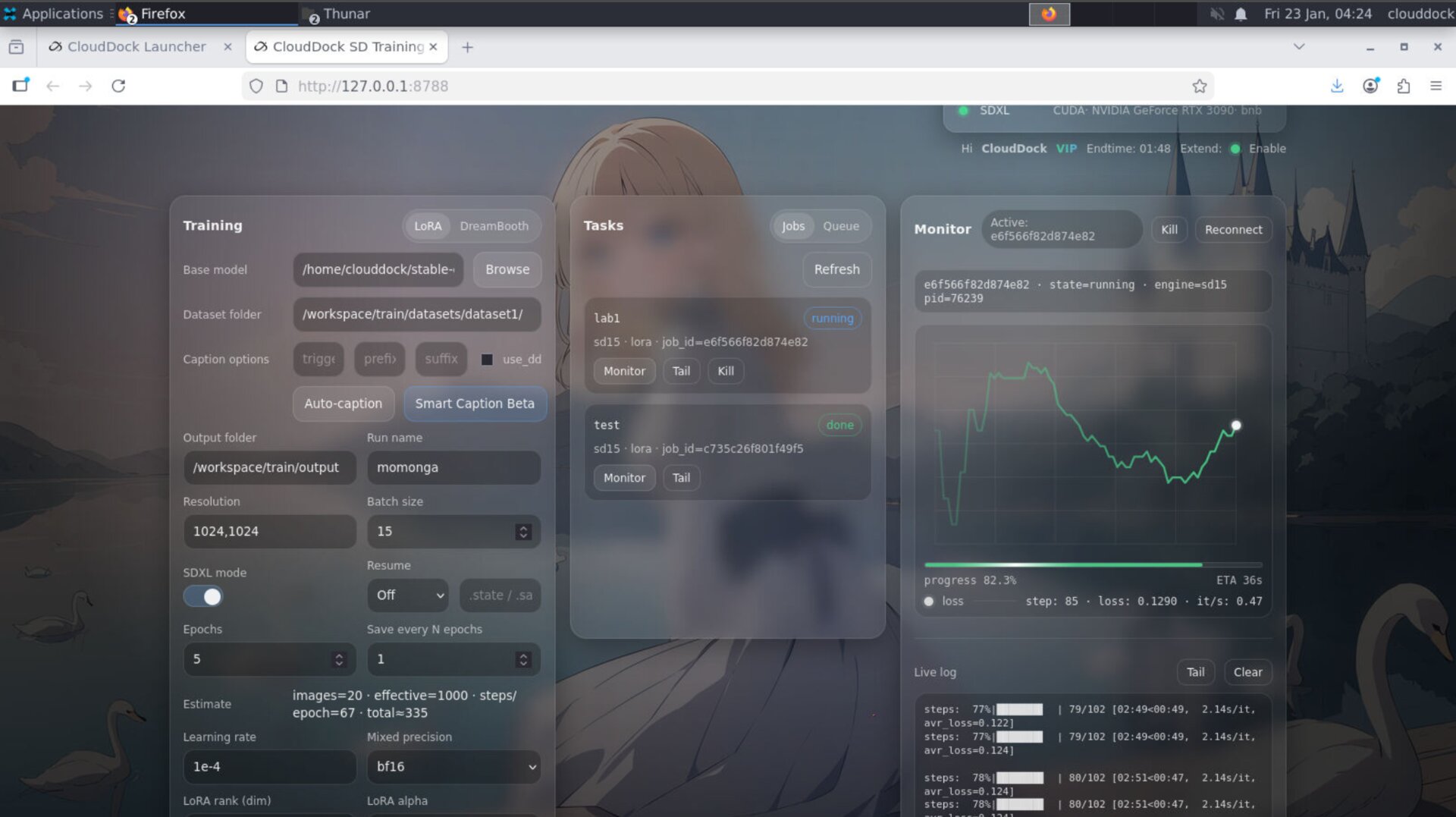
- Central Scheduler (big one): Queue + job lifecycle no longer depends on the page being open.
- Training keeps running: close tab / refresh page / browser restart — jobs continue.
- Built-in Progress + ETA: no more “stare at SSE logs to guess progress”.
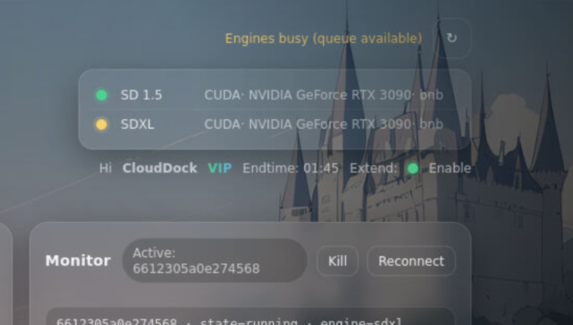
- Stock-style live view: progress, speed, and key stats are visible at a glance.
- Dynamic loss curve coloring: the loss line follows your loss trend in real time (less “white screen”).
- Caption progress: stop checking folders — captioning progress is built into the UI.
- Flexible model picker: pick models from any valid path in your CloudDock user directory (no forced moving).
- Launcher session awareness: shows session end time + Pass renew status, so you don’t have to bounce back to Dashboard.
Central Scheduler — the tab is no longer the brain
The biggest pain of the old workflow was simple: queue state lived too close to the UI runtime. If the browser got refreshed, suspended, or the tab died, you could end up with missing history, dropped queue context, or inaccurate “running vs queued” 판단.
4.1.3 moves scheduling into a centralized system inside Training Center. The UI becomes a window — not the scheduler itself. This improves reliability and makes job state consistent.
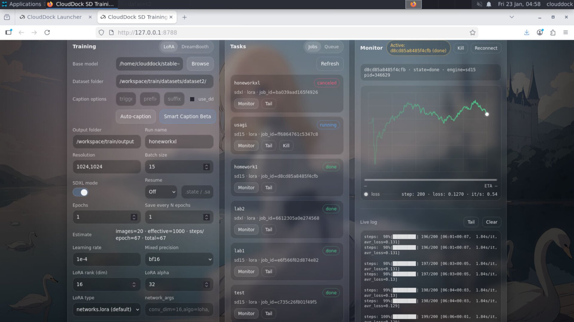
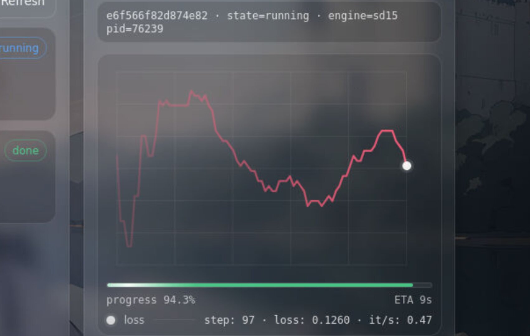
Progress Bar + ETA — built in, always visible
You used to “read the SSE log” to infer progress. In 4.1.3, Training Center includes a first-class progress bar and ETA, designed to feel like a live dashboard — not a debugging console.
Loss curve that feels alive
In earlier builds, the loss chart could look like a “white wall” — hard to read, hard to feel progress. 4.1.3 makes it more like a live instrument: the curve follows the loss value trend and changes color dynamically, so you can sense stability or turbulence instantly.
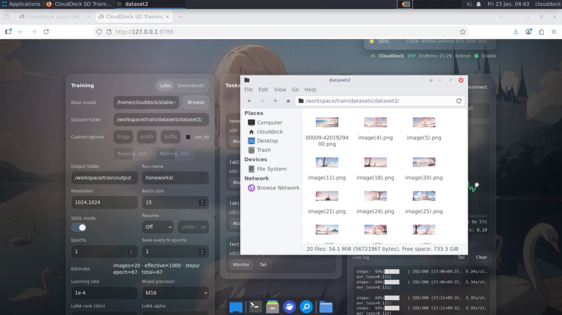
Caption progress — stop checking folders
Captioning used to be a “go to the folder and guess whether it’s done” experience. In 4.1.3, caption has a built-in progress view — so you can see status, pacing, and completion without leaving the page.
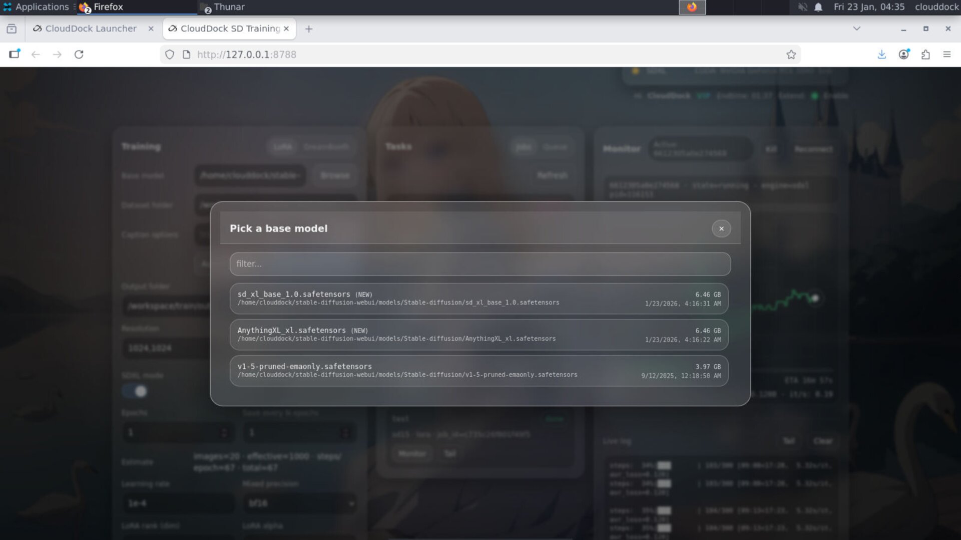
Model picker — pick from anywhere you actually store models
4.1.3 upgrades model selection to match real user behavior: models can be selected from any valid path inside your CloudDock user directory. Downloaded a model into a “download” folder and don’t want to move it? No problem — it’s selectable.
- Flexible paths: any legal path under your user directory
- Useful labels: shows model name + size (so you know what you’re selecting)
- Less friction: no “move files to satisfy UI” ritual
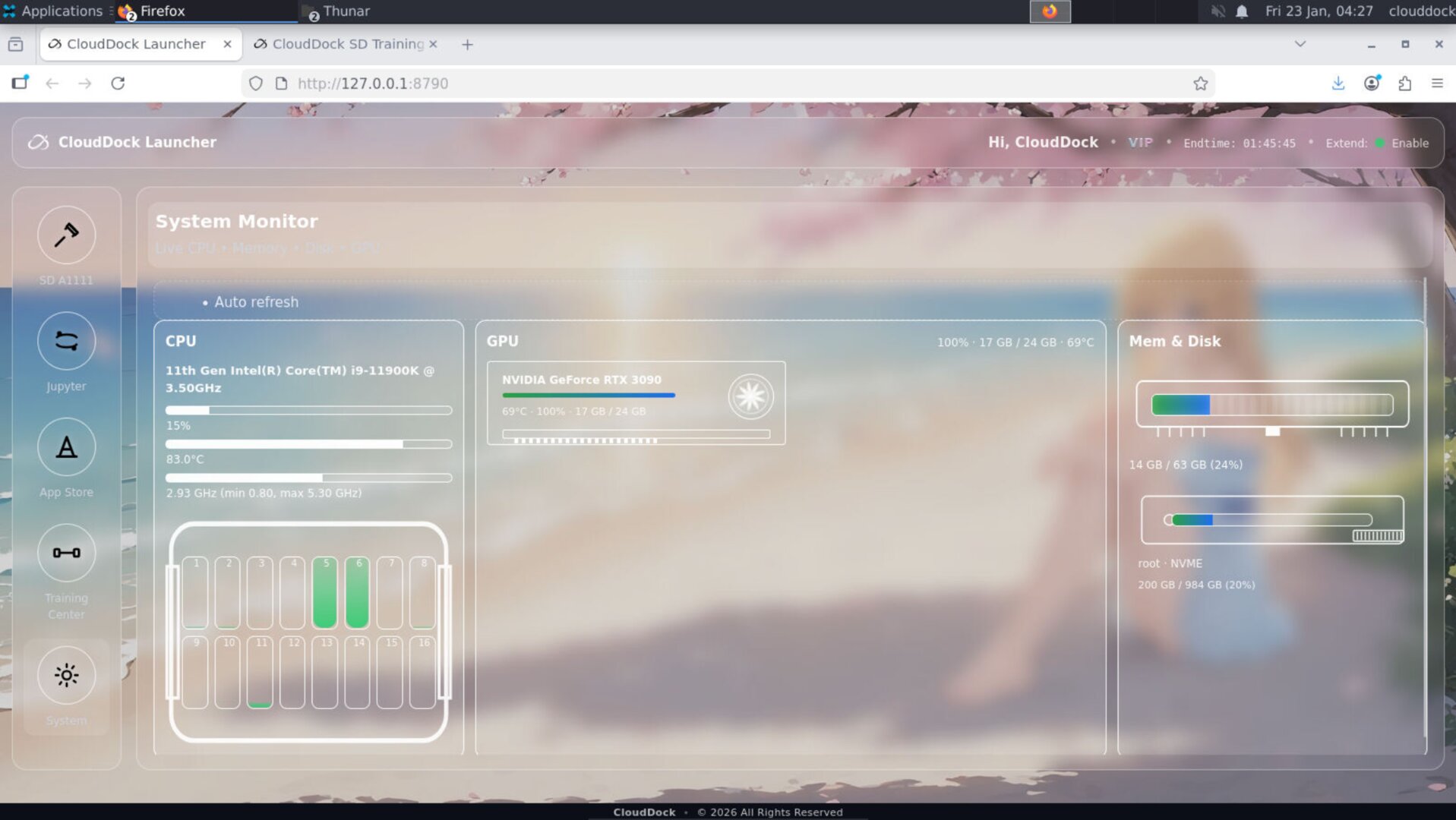
Launcher awareness — end time + renew status
The most “quietly life-saving” feature: CloudDock Launcher + SD Training Center can show your session end time. No more tabbing back to Dashboard just to check remaining time.
If you have CloudDock Pass, you’ll also see Session Extend availability status directly in the container UI. For fairness, the system won’t auto-renew for you — but it will remove the anxiety and make your next step obvious.
Small changes that feel huge
- Job & Queue naming: custom names show up cleanly — more readable queues.
- Less false judgment: job state detection is more accurate and less “random”.
- More “app-like”: Training Center feels like a product UI, not a dev panel.
Positioning
- 4.0: “Oh, CloudDock has an ecosystem.”
- 4.1: “Wait… the ecosystem can be this?”
- 4.1.3 (Beta 3): “I can treat this like a real workflow. Close the page — it still runs.”
Quick Checks
watch -n 1 nvidia-smips aux | egrep "train|kohya|sd-scripts|accelerate"Troubleshooting
- “I refreshed the page — is my job dead?” No. In 4.1.3 the scheduler is centralized; the UI is just a window.
- “The UI shows ‘reconnecting’ / missing data briefly.” Refresh is safe; job state will rehydrate.
- “Loss chart looks different now.” Intended — dynamic coloring makes trend readable and avoids the “white wall” look.
- “Why do I see end time in Launcher now?” That’s the point — you shouldn’t have to bounce back to Dashboard for time anxiety.